

Before a customer reads a single word on your website, they've already formed an opinion about your business. How? Through your typography.
The shapes of your letters are your brand's body language, telling a story of professionalism, creativity, trustworthiness, or carelessness—all in a single glance.
Typography is not about decoration; it's about communication. It's the quietest, yet most constant, messenger of your brand's personality. While there are technical rules that matter, what business owners really need is a strategic understanding of how different typographic styles feel and what they communicate to customers.
This isn't a technical manual for designers—it's a strategic field guide for business owners who want their brand to speak with intention.
After almost a decade years of watching businesses make font choices based on what looks "pretty" rather than what works strategically, we can tell you that your typography is making or breaking first impressions every single day. Let's fix that.
The Emotional Power of Typography: More Than Just Letters
Here's what most business owners don't realize: fonts have personalities, and those personalities directly influence how customers perceive your business.
A law firm using a playful script font will struggle to convey authority. A children's brand using a stark, industrial sans-serif will feel cold and unwelcoming. A luxury brand using the same font as their bargain competitors will undermine their premium positioning.
Typography is psychology in action. The curves, angles, weights, and proportions of letters trigger emotional responses that happen faster than conscious thought. These responses influence trust, credibility, and purchase decisions.
But here's the key insight: You don't need to understand the psychology to use it effectively. You just need to understand the strategic implications of different typographic styles and choose the one that aligns with your brand's goals and your audience's expectations.
The Four Families of Type: Your Strategic Palette
Every font falls into one of four basic categories, each with distinct personality traits and strategic applications. Understanding these categories is like having a decoder for brand communication.

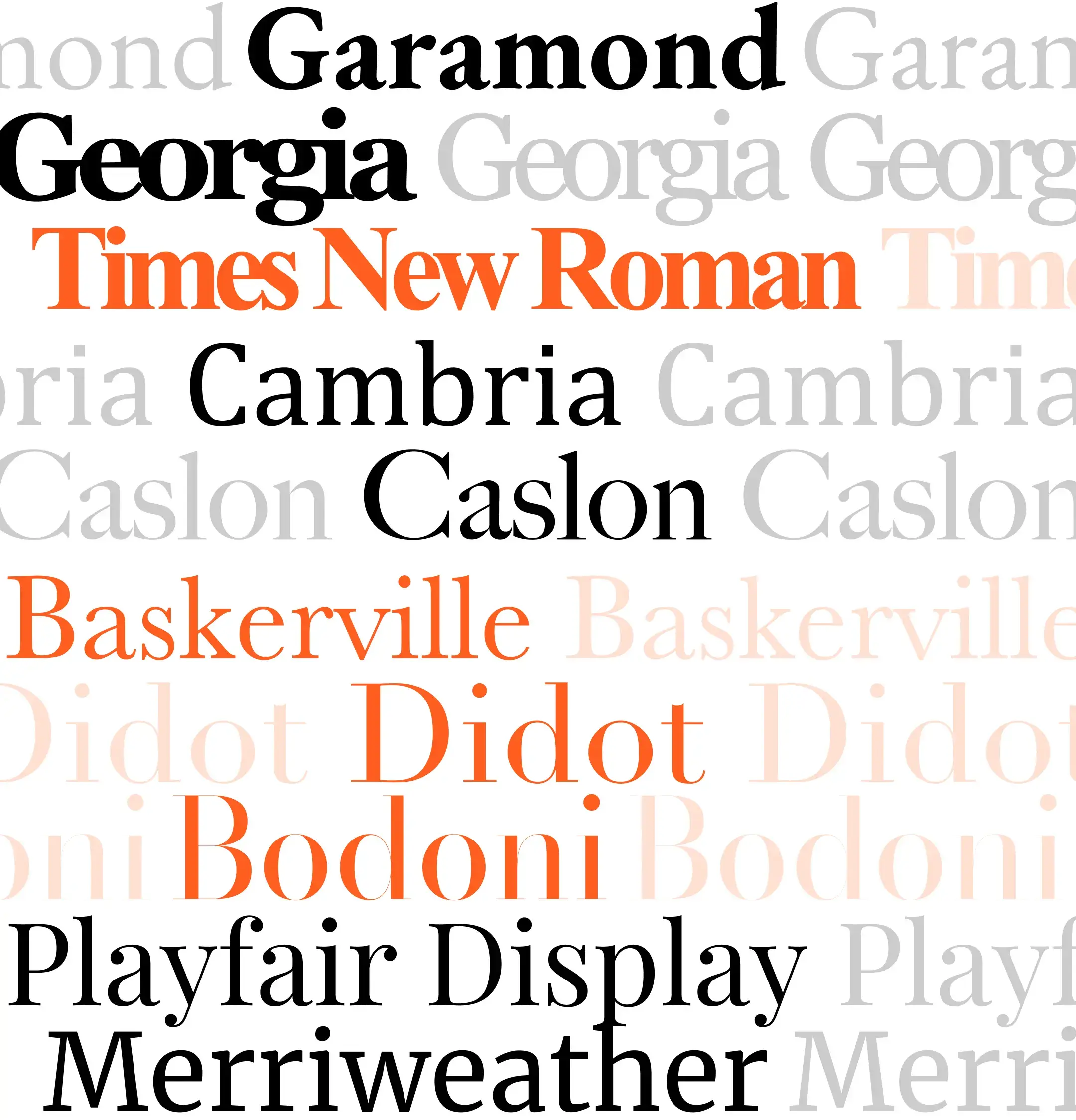
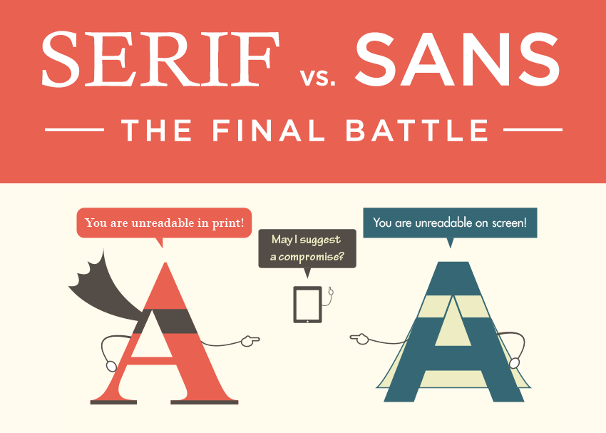
Serif Fonts: The Traditionalist
- Personality: Authoritative, traditional, trustworthy, established, formal, sophisticated
- The Science: Serifs are the little "feet" or flourishes at the ends of letterstrokes. They were originally designed to help the eye flow along lines of text in printed books, which is why they feel scholarly and established.
- Strategic Application: Serif fonts work best for brands that need to convey expertise, tradition, and reliability. Think law firms, financial institutions, universities, premium publications, and established businesses that want to emphasize their experience and credibility.
- Brand Examples:
- The New York Times: Uses a serif for their nameplate to convey journalistic authority and tradition
- Mercedes-Benz: Their wordmark uses a refined serif to communicate luxury and heritage
- Harvard University: Classic serif typography reinforces academic prestige and institutional authority
- The Warning: Serif fonts can feel dated or stuffy if not used thoughtfully in a modern context. They can also become difficult to read at small sizes on screens.
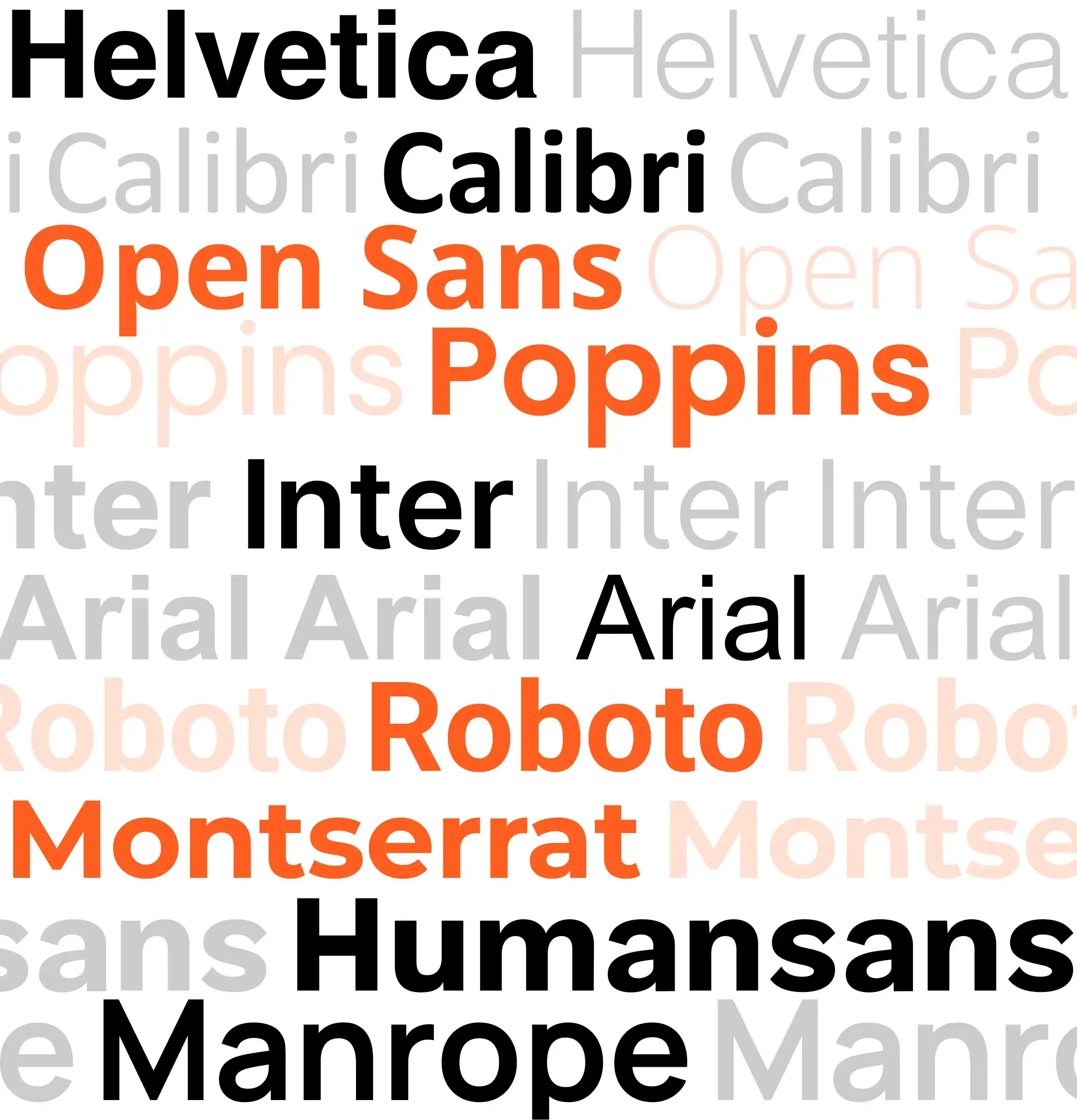
Sans-Serif Fonts: The Modernist
- Personality: Clean, modern, minimalist, approachable, direct, efficient, contemporary
- The Science: "Sans" means "without" in French, so sans-serif fonts are literally "without serifs." They emerged in the 20th century as a reaction to ornate Victorian design, embodying modernist principles of simplicity and function.
- Strategic Application: Sans-serif fonts are perfect for brands that want to feel current, straightforward, and accessible. They work exceptionally well for tech companies, startups, healthcare brands, and any business that wants to feel progressive and user-friendly.
- Brand Examples:
- Apple: Uses their custom San Francisco font family across all products to maintain clean, modern consistency
- Google: Clean sans-serif typography reinforces their mission to make information accessible and simple
- Airbnb: Switched to a custom sans-serif to feel more welcoming and less corporate
- The Warning: Generic sans-serif fonts (like Arial or Helvetica) can feel corporate and soulless without strategic application. The key is choosing a sans-serif with character that matches your brand personality.
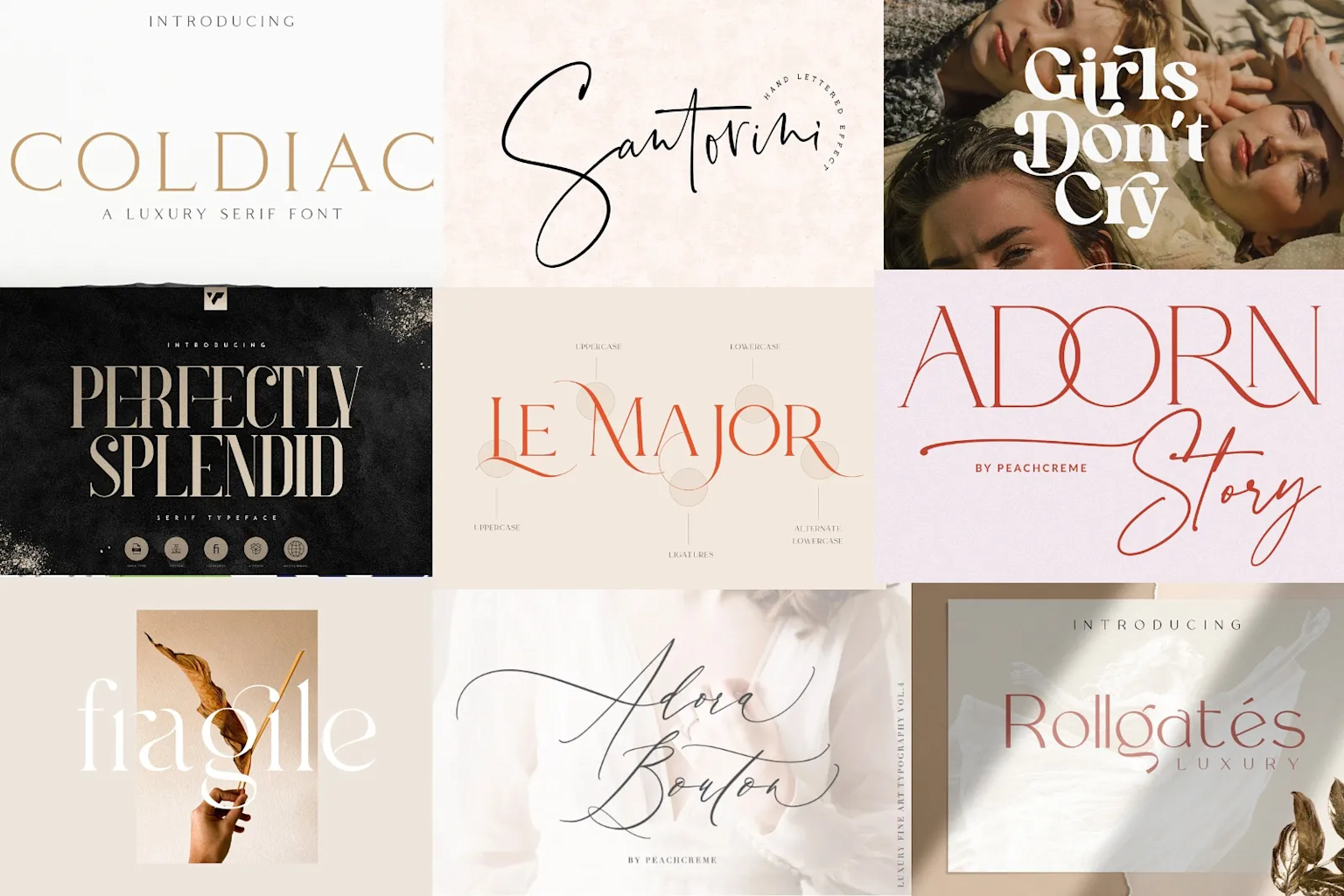
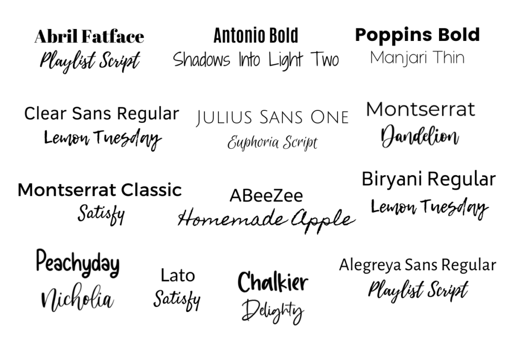
Script Fonts: The Humanist
- Personality: Elegant, personal, creative, luxurious, friendly, handcrafted, distinctive
- The Science: Script fonts mimic handwriting or calligraphy, adding a human touch that feels personal and crafted. They range from formal calligraphy to casual hand-lettering styles.
- Strategic Application: Script fonts are powerful accent fonts that add personality and warmth. They work beautifully for luxury brands, creative businesses, wedding services, artisanal products, and any brand that wants to feel personal and bespoke.
- Brand Examples:
- Mailchimp: Uses script elements to feel more approachable and less "corporate" than their email marketing competitors
- Glossier: Script elements in their branding reinforce the handcrafted, personal approach to beauty
- Instagram: The classic script logo conveyed creativity and personal expression (before their rebrand)
- The Critical Warning: Script fonts are terrible for body text—they're nearly impossible to read in paragraphs. They should be used sparingly, typically only for headlines, logos, or short emphasis text. Overuse makes a brand look unprofessional and difficult to engage with.
Display Fonts: The Rebel
- Personality: Expressive, bold, stylized, unique, attention-grabbing, creative, memorable
- The Science: Display fonts are designed specifically for large sizes and short text. They prioritize impact and personality over readability, often incorporating unique shapes, textures, or stylistic elements.
- Strategic Application: Display fonts are perfect for headlines, logos, and situations where you need to grab attention quickly. They work well for entertainment brands, events, fashion, restaurants, and any business that needs to stand out in a crowded market.
- Brand Examples:
- Netflix: Uses a bold, custom display font that commands attention on movie posters and marketing materials
- Spotify: Their custom display font feels energetic and modern, perfect for a music platform
- FedEx: The custom display font in their logo is both professional and distinctive
- The Cardinal Rule: Display fonts are like hot sauce—a little goes a long way. They should never be used for body text or extended reading. Their job is impact, not legibility.

The Strategic Font Pairing System
Most businesses fail at typography because they try to make every font choice independently. Professional brands understand that fonts work as a system, with each typeface playing a specific role in the brand's communication hierarchy.
Here are three foolproof approaches for combining fonts that work every time:
Strategy 1: Contrast and Complement (Serif + Sans-Serif)
- The Rule: Pair a serif font with a sans-serif font to create clear contrast and visual interest.
- Why It Works: The contrast between serif and sans-serif creates natural hierarchy—one feels more formal and authoritative, the other more modern and accessible. This combination gives you the best of both worlds.
- Application: Use the serif for headlines when you want to convey authority, and the sans-serif for body text when you want readability. Or reverse it—sans-serif headlines for modern appeal, serif body text for traditional credibility.
- Real-World Example: Many premium publications use this approach—serif headlines for gravitas, sans-serif body text for digital readability.
Strategy 2: Flair and Foundation
- The Rule: Pair one expressive font (script or display) with one neutral, workhouse font (clean sans-serif).
- Why It Works: The expressive font provides personality and brand differentiation, while the neutral font handles the heavy lifting of readability and information hierarchy.
- Application: Use the expressive font sparingly—for logos, main headlines, or accent elements. Use the neutral font for everything else—subheads, body copy, navigation, etc.
- Real-World Example: Once Upon A Business uses Beauty Salon Script (the flair) paired with Inter (the foundation). The script provides magical personality for brand elements, while Inter handles all functional communication with clarity and professionalism.
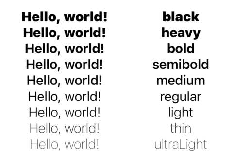
Strategy 3: The Family Plan (Multiple Weights, One Font)
- The Rule: Use a single "superfamily" font that comes in multiple weights and styles (light, regular, bold, black, italic, condensed, etc.).
- Why It Works: This is the most sophisticated and fool-proof approach. It guarantees visual harmony while still allowing for clear hierarchy and variety.
- Application: Create hierarchy through weight and size rather than different fonts. Use light weights for elegant headlines, bold weights for emphasis, regular weight for body text.
- Real-World Examples:
- Apple: Uses their San Francisco family across all applications, creating consistency through weight variation
- Google: Uses their Roboto family system across all their products and services
Typography Role Models: How Successful Brands Use Type
Let's examine how three very different brands use typography to reinforce their strategic positioning:
Apple: The Minimalist Master
- Strategy: Apple uses their custom San Francisco font family across every product and communication. This creates unprecedented consistency and reinforces their brand values of simplicity and precision.
- Key Insights:
- Single Family System: Everything from iPhone interfaces to marketing materials uses the same typographic foundation
- Weight-Based Hierarchy: They create variety through different weights (ultralight to black) rather than different fonts
- Legibility Obsession: Every weight and size is optimized for readability across different screen sizes and conditions
- Business Lesson: You don't need multiple fonts to create visual interest. A single, well-chosen font family with multiple weights can provide all the variety you need while maintaining perfect brand consistency.

Nike: The Bold Motivator
- Strategy: Nike uses bold, condensed typography (often Futura Condensed Extra Bold) to convey power, urgency, and athletic performance.
- Key Insights:
- Condensed Power: Their typography feels compressed and energetic, like a runner ready to sprint
- All-Caps Authority: Many Nike headlines use all capitals to create shouting, motivational energy
- Minimal Word Count: Their typography choices support their "Just Do It" philosophy—short, powerful statements
- Business Lesson: Your typography should reinforce your brand's core message. Nike's bold, condensed fonts perfectly match their motivational, action-oriented brand personality.
The New York Times: The Authority Architect
- Strategy: The Times uses a careful combination of serif and sans-serif fonts to balance journalistic authority with digital readability.
- Key Insights:
- Serif Headlines: Traditional serif fonts for major headlines convey journalistic credibility and importance
- Sans-Serif Body Text: Modern sans-serif fonts for article text ensure easy reading on all devices
- Consistent Hierarchy: Every article follows the same typographic structure, creating familiarity and trust
- Business Lesson: You can honor tradition while embracing modernity. The key is applying your typographic choices systematically across all communications.
Practical Typography Guidelines for Non-Designers
You don't need to be a designer to make smart typographic choices. Here are the essential rules that will immediately improve your brand's communication:
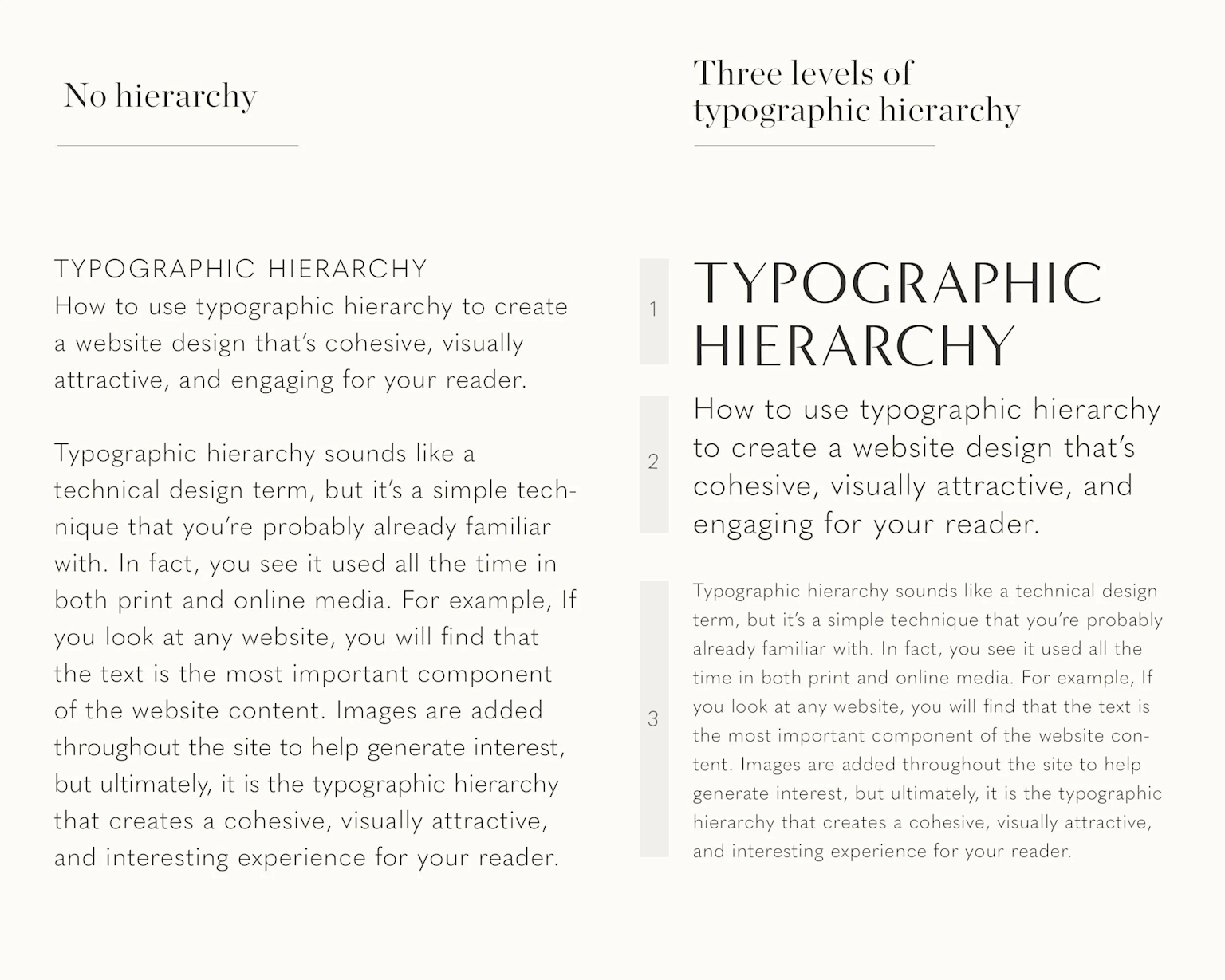
Rule 1: Hierarchy is Your Best Friend
- The Problem: When everything looks equally important, nothing is important.
- The Solution: Create clear visual distinction between different types of information:
- Headlines: Should be significantly larger and bolder than everything else
- Subheads: Smaller than headlines but larger than body text, often using a different weight
- Body Text: Optimized for readability, typically the most neutral weight and size
- Captions/Fine Print: Smaller than body text, often in a lighter weight
- The Test: Squint at your page. Can you still identify the most important elements? If everything blends into gray mush, your hierarchy needs work.
Rule 2: Readability First, Always
- The Problem: Falling in love with a "cool" font that's impossible to read.
- The Solution: Before committing to any font, paste a full paragraph of text and ask yourself:
- Can I read this comfortably on my phone?
- Would my customers be able to read this easily?
- Does this font work at both large and small sizes?
- The Reality Check: If a font requires effort to read, it's not a body text font—it's a display font that should only be used for headlines or logos.
Rule 3: Consistency Beats Creativity
- The Problem: Using different fonts randomly across different materials and platforms.
- The Solution: Once you choose your fonts, use them everywhere. Your website, business cards, social media, email signatures, presentations—everything should use the same typographic system.
- The Strategic Benefit: Consistency creates subconscious recognition. When customers see your typography, they should immediately think of your brand, even before they see your logo.
Rule 4: White Space Is Your Secret Weapon
- The Problem: Cramming text together to fit more on the page.
- The Solution: Give your typography room to breathe:
- Add space between paragraphs
- Don't cram headlines against body text
- Use generous margins
- Remember that white space makes everything look more premium and easier to read
- The Business Impact: Generous white space makes your brand feel more premium and professional, while cramped text makes everything look cheap and difficult to engage with.
Common Typography Mistakes That Kill Brands
These are the errors I see repeatedly, and they're all easily avoidable:
Mistake 1: Using Too Many Fonts
- The Problem: Thinking more fonts equals more personality.
- The Reality: More than three font families makes your brand look disorganized and unprofessional.
- The Fix: Limit yourself to two font families maximum. If you need more variety, choose fonts with multiple weights rather than multiple families.
Mistake 2: Script Fonts for Body Text
- The Problem: Using decorative or script fonts for paragraphs of text.
- The Reality: Script fonts are designed for short, impactful text. Using them for body copy makes your content nearly impossible to read.
- The Fix: Reserve script and display fonts for headlines, logos, and accent text only.
Mistake 3: Ignoring Mobile Readability
- The Problem: Choosing fonts that look great on desktop but are unreadable on phones.
- The Reality: Most of your customers will see your typography on mobile devices first.
- The Fix: Always test your font choices on actual mobile devices. If you have to zoom in to read it comfortably, choose a different font.
Mistake 4: Following Font Trends
- The Problem: Choosing fonts because they're popular right now rather than because they fit your brand strategy.
- The Reality: Typography trends change, but your brand needs consistency over time.
- The Fix: Choose fonts based on your brand personality and customer needs, not current design trends.
Your Typography Is Your Voice
Your font choices are not decorative afterthoughts; they are strategic business decisions.
They are the clothing your words wear, and they tell your customers whether to lean in and listen or to tune out completely. They communicate trustworthiness or skepticism, premium quality or budget pricing, modern innovation or traditional expertise—all before a single word is read.
The most successful brands understand that typography is not about finding the "perfect" font. It's about choosing fonts strategically based on your brand personality and customer expectations, then applying them systematically across every communication touchpoint.
You don't need to be a designer to make smart typographic choices. By understanding the strategic implications of serif vs. sans-serif, the power of script accents, and the impact of display fonts, you can build a brand that communicates with clarity, confidence, and purpose.
The framework is simple:
- Understand your brand personality and what emotions you want to evoke
- Choose font families that naturally align with those emotions
- Create clear hierarchy so customers can easily navigate your information
- Apply consistently across all brand touchpoints
- Prioritize readability over creativity in body text
Look at your website right now. What is your typography saying about you? Is it the voice you want for your brand? Is it making your message easier or harder to receive?
If your current typography isn't working as hard as it should be, it's time to give your brand a voice that matches your ambitions.
Typography is the foundation of brand communication. Get it right, and everything else becomes easier. Get it wrong, and you're fighting an uphill battle for credibility and connection.

Discover Your Happily Ever After
Subscribe to get weekly updates on how you can start handling departmental plot holes in your story!
Related posts
Check out other posts similar to the one you just read!