

I'm going to save you thousands of dollars and countless hours of debate: "red means passion" is nonsense, "blue means trust" is a half-truth, and "green means nature" is the most generic advice in branding.
The idea that colors have fixed, universal meanings is the biggest lie in our industry, and I'm tired of watching business owners make critical branding decisions based on Pinterest infographics about color psychology.
Here's what almost a decade in this business has taught us: Red is the color of love, but also of debt and danger. Blue is the color of trustworthy banks, but also of coldness and depression. Purple is royal elegance, but also the color of a cheap plastic toy from a dollar store.
The meaning is never in the color itself—it's in the context, application, and strategic intent behind how you use it.
Your brand's story gives color its meaning, not the other way around.
The Color Theory Lie Everyone Believes
Walk into any design meeting, and I guarantee someone will say, "We need blue because it means trust." This lazy thinking has infected our entire industry, and it's costing businesses their competitive advantage.
Here's the uncomfortable truth: Color psychology as it's commonly taught is a massive oversimplification based on studies from the 1940s that have been misinterpreted and bastardized into marketing gospel. The research behind "red makes you hungry" comes from a handful of studies with sample sizes smaller than your last team meeting.
But let's play along with the conventional wisdom for a moment. If blue universally means trust, why does Facebook (untrustworthy to many) use blue? If red means passion and energy, why do stop signs use it to make you brake? If green means nature and calm, why do we use it for money and "go" signals?
The answer is simple: context is everything.

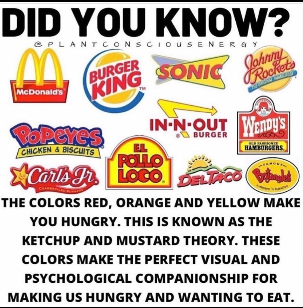
Take McDonald's famous red and yellow combination. Marketing experts call this the "ketchup and mustard theory"—the idea that these colors subconsciously remind us of those condiments, reinforcing our craving for burgers and fries. Clever, right?
Except that's not why McDonald's chose those colors.
The golden arches started as actual architectural features in 1953—25-foot yellow metal arches designed to be visible from far away and draw drivers off the highway. The red was added later as a background to make the signage even more attention-grabbing. The ketchup and mustard association came after decades of consistent application, not before.
McDonald's didn't succeed because red and yellow "make you hungry." They succeeded because they used red and yellow consistently for 70 years while delivering on a specific promise: fast, cheap, and familiar food.
The color psychology industry wants you to believe that colors have inherent, magical properties. The truth is that brands give colors their meaning through relentless, strategic application.
The Only Part of Color Theory That Actually Matters: Harmonies
While color psychology is largely marketing mythology, color harmony is the foundation of every effective brand system. This is where the technical knowledge becomes genuinely valuable.
Color harmonies aren't about feelings or psychology—they're about creating visual relationships that work. They're the difference between a palette that looks sophisticated and one that looks like a child's birthday party exploded.
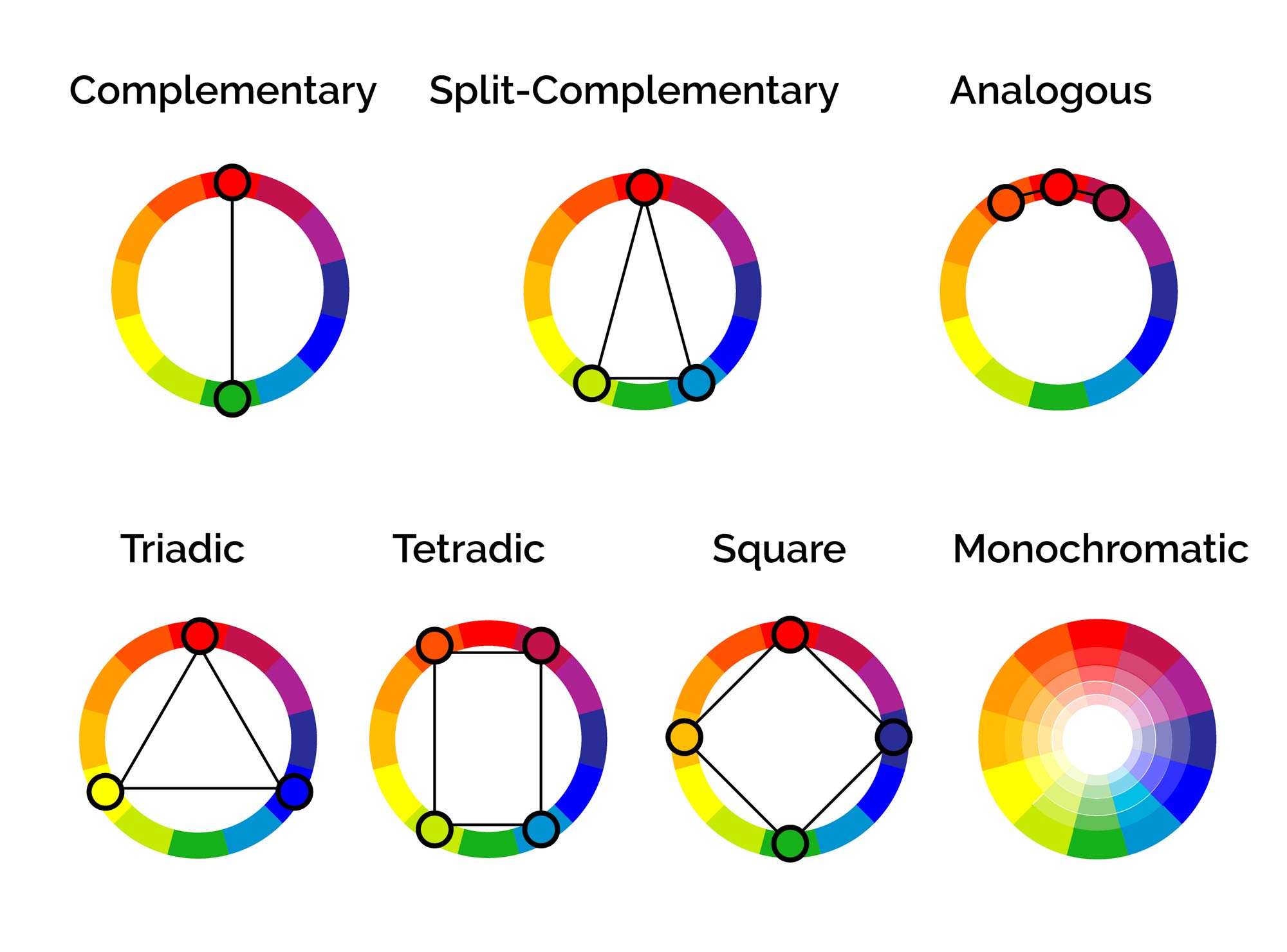
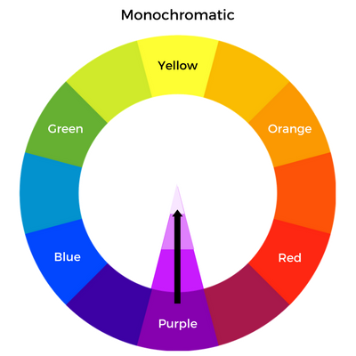
Monochromatic: The Sophisticated Choice
Using different shades, tints, and tones of a single color. This is the fastest way to look premium and unified without thinking too hard.
When it works: Luxury brands, professional services, anything that needs to look expensive and refined.
Example: Think of high-end skincare brands that use various shades of white, cream, and soft gray. The monochromatic approach instantly communicates sophistication.
Analogous: The Harmonious Approach
Colors that sit next to each other on the color wheel (like blue and green, or orange and red). Creates natural, pleasing combinations that feel organic.
When it works: Wellness brands, outdoor companies, anything that wants to feel natural and calming.
Why it works: These colors share common undertones, so they naturally complement each other without creating visual tension.

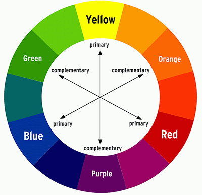
Complementary: The High-Impact Strategy
Colors directly opposite each other on the color wheel (like orange and blue, or red and green). Creates maximum contrast and visual punch.
When it works: Sports brands, tech startups, anything that needs to grab attention and stand out from competitors.
Warning: This is the hardest harmony to execute well. Get the proportions wrong, and you'll look like a circus.
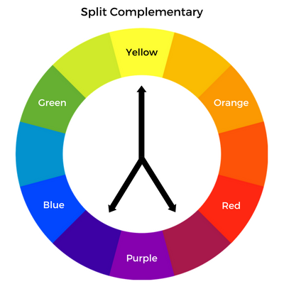
Split-Complementary: The Sophisticated Alternative
Instead of using direct opposites, you use one color plus the two colors adjacent to its complement. Less jarring than true complementary, but still high-contrast.
When it works: When you want impact without the potential harshness of direct complementary colors.
Triadic: The Dynamic Choice
Three colors evenly spaced around the color wheel. Think of Burger King's old red, yellow, and blue scheme.
When it works: Playful brands, children's products, anything that wants to feel energetic and vibrant.
Why it's risky: Three strong colors competing for attention can quickly become chaotic without expert execution.

Tetradic (Square): The Complex System
Four colors forming a square on the color wheel. Offers the most variety but requires the most skill to execute.
When it works: Complex brands with multiple product lines or extensive sub-branding needs.
Reality check: Most businesses should avoid this. It's too easy to create visual chaos.
The key insight: These harmonies work because they create predictable visual relationships, not because of any mystical color meanings. A well-executed complementary scheme will always look more professional than a random collection of "meaningful" colors.

Context is King: How Your Brand Gives Color Its Meaning
This is where most businesses get it catastrophically wrong. They choose colors based on generic psychology instead of strategic positioning.
The meaning of any color is determined by three factors: your audience, your competitive landscape, and your brand narrative. Get these right, and you can make any color work. Ignore them, and even "perfect" color psychology will fail.
Audience: The Same Color, Different Meanings
A vibrant hot pink means "fun and approachable" to a 16-year-old shopping for makeup. That same pink means "unprofessional and frivolous" to a 55-year-old choosing a financial advisor.
This isn't color psychology—it's cultural conditioning.
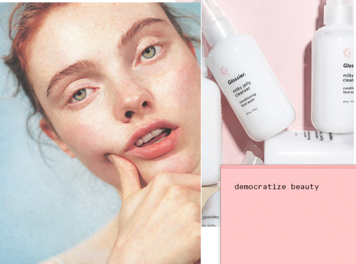
Glossier built their entire brand around their trademarked shade of millennial pink, but that strategy only works because their audience was primed to see pink as modern, gender-neutral, and rebellious against traditional beauty standards.
Try that same pink for a law firm, and watch your credibility evaporate.
The same color can simultaneously mean sophistication (to one audience) and immaturity (to another). Your job isn't to find the "right" color—it's to choose a color that resonates with the people you actually need to serve.
Competition: The Power of Strategic Opposition
The most powerful use of color is often to do exactly the opposite of everyone else.
If every bank in your market uses blue, choosing a bold orange or deep green could be the smartest strategic move you make. T-Mobile's magenta exists specifically to stand out in a sea of Verizon red and AT&T blue.
This is strategic differentiation, not color psychology.
When we (Once Upon A Business) chose purple for their brand system, it wasn't because "purple means royal" or "purple means mystical." It was because purple perfectly embodies their brand duality: mystical enough to represent the "Once Upon a..." fairy tale aspect, but rich and sophisticated enough to convey serious business expertise.
More importantly, none of their competitors were using purple. In a market full of corporate blues and trustworthy grays, purple makes them instantly recognizable.
Brand Narrative: Making Color Work for Your Story
Here's the secret most designers won't tell you: Any color can mean anything if you apply it consistently within a coherent brand story.
Our (Once Upon A Business) purple isn't magical because purple is inherently mystical. It's effective because they've systematically applied it within a narrative framework that makes sense:
The Color Strategy:
- Find The Work (#B6E8FC - Anakiwa Light): Light, aspirational blue representing the open sky of possibility
- Get The Work (#7364D2 - Moody Blue): Deeper, more intense purple representing the focused energy of pursuit
- Do The Work (#3D0E61 - Jagger): The deepest purple, representing the substantial foundation of execution
This isn't color psychology. This is strategic storytelling.
Each color reinforces a specific stage of their customer journey while maintaining visual cohesion through the purple family. The meaning comes from the story, and the story is reinforced through consistent application.
The Generational Color Code: Why Age Defines Preference
Here's something most color theorists ignore: Your audience's age significantly impacts how they interpret and respond to different colors. This isn't psychology—it's cultural programming.
Each generation grew up with different color associations, media influences, and cultural contexts that shape their preferences. Understanding these patterns gives you a massive advantage in audience-specific marketing.
Baby Boomers: Neutral Territory (Born 1946-1964)
- Preferred Palette: Beige, gray, muted blues, deep reds, browns
- Why These Colors Work: Boomers associate these colors with stability, maturity, and traditional values. They grew up in an era when bold colors were associated with youth rebellion, so they gravitate toward "sophisticated" neutrals.
- Strategic Application: Financial services, healthcare, luxury goods, retirement planning
Avoid: Neon colors, millennial pink, anything that feels "trendy" over timeless - Real-World Example: Every major bank uses blue for a reason. It signals the stability and trustworthiness that Boomers expect from financial institutions.

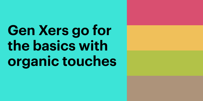
Generation X: Organic Basics (Born 1965-1980)
- Preferred Palette: Enhanced neutrals with natural accents—greens, earth tones, deeper blues
- Why These Colors Work: Gen X bridges traditional and modern. They want the stability of neutral colors but with more personality than pure Boomer beige.
- Strategic Application: Financial apps, home improvement, family-focused services
Color Psychology Insight: Avocado green resonates with this generation partly due to nostalgia—many grew up with avocado-colored appliances. - Real-World Example: Financial apps like Mint use various shades of green to appeal to Gen X users who want modern functionality with organic, trustworthy feeling.
Millennials: Pink Power (Born 1981-1996)
- Preferred Palette: Millennial pink, bright mint, coral, baby blue, lavender
- Why These Colors Work: Millennials reclaimed pink as a gender-neutral color and embraced bright, Instagram-friendly palettes. These colors photograph well and feel optimistic despite economic challenges.
- Strategic Application: Beauty brands, lifestyle products, apps, social media marketing
The Millennial Pink Phenomenon: This isn't just a color trend—it's a cultural statement about rejecting traditional gender norms and embracing authentic self-expression. - Real-World Examples: Glossier, Airbnb's coral rebrand, Apple's rose gold products

Generation Z: Bright and Bold (Born 1997-2012)
- Preferred Palette: Gen Z yellow, bright greens, high-contrast combinations, saturated colors
- Why These Colors Work: Gen Z grew up with Instagram and TikTok. They prefer colors that pop on social media and reflect optimism and energy.
- Strategic Application: Social media marketing, youth-focused products, anything that needs to be "shareable"
The Instagram Effect: Colors need to work in digital formats and look good with heavy saturation filters. - Real-World Example: Brands like Billie Razors use bright, saturated colors specifically designed to perform well on social media platforms.
- The Strategic Insight: Understanding these generational preferences allows you to choose colors that feel natural and appealing to your specific audience, regardless of generic color psychology rules.

How To Build a Usable Color System
Most businesses fail at color implementation because they choose pretty colors without building functional systems. Here's how to create a color palette that actually works for your business.
Step 1: Define Your Color Hierarchy
- Primary Colors (60% of usage): Your brand workhorses. These appear in logos, headers, and major brand applications.
- Secondary Colors (30% of usage): For differentiation, sub-sections, and supporting elements.
- Accent Colors (10% of usage): High-impact colors used sparingly for buttons, links, and critical highlights.
This isn't creative theory—it's practical application. The 60-30-10 rule prevents visual chaos while ensuring your brand has enough variety to stay interesting.
Step 2: Technical Specifications That Matter
Digital Requirements:
- HEX codes for web and digital applications
- RGB values for screen-based design
- Accessibility compliance (WCAG contrast ratios)
Print Requirements:
- CMYK values for professional printing
- Pantone matches for exact color reproduction
- Paper/substrate considerations (colors look different on different materials)
Why This Matters: Nothing destroys brand consistency faster than colors that look completely different across applications.
Step 3: Usage Rules and Applications
Define exactly when and where each color appears:
- What percentage of any design can be your primary color?
- Which colors never appear together?
- How do colors behave on different backgrounds?
- What happens when you need to simplify to fewer colors?
Create systematic solutions for recurring challenges:
- Text legibility over brand imagery
- Color behavior in different lighting conditions
- Accessibility requirements for color-blind users
- Social media profile consistency
Step 4: Test in Real-World Applications
Before finalizing your palette:
- Test it across all your actual marketing materials
- Check legibility on mobile devices
- Print test sheets on your actual paper stocks
- Get feedback from representatives of your target audience
The reality check: If your team can't consistently apply your colors across different applications, your system needs work.
Advanced Color Strategy: Harmonies in Action
Once you have a solid foundation, strategic color systems can handle sophisticated challenges that separate industry leaders from followers.
Seasonal and Campaign Adaptations
The Challenge: How do you maintain brand consistency while allowing for timely, relevant variations?
The Solution: Create flexible systems that accommodate variation within defined parameters.
Framework:
- Unchangeable Elements: Core brand colors, primary applications
- Flexible Elements: Accent colors, seasonal filters, campaign-specific applications
- Seasonal Rules: How far variations can deviate while maintaining recognition
- Return Protocol: How and when to return to core brand expression
Example: Starbucks maintains their core green while introducing seasonal colors for holiday campaigns. The green stays consistent, but accent colors shift to reds and golds for Christmas, pastels for spring, etc.
Multi-Brand Architecture
The Challenge: What happens when your business has multiple service lines or locations that need different approaches while maintaining connection to the parent brand?
The Solution: Develop a master brand system with defined variation rules.
Approach:
- Master Brand: Core colors, primary harmony, foundational applications
- Sub-Brand Variations: Modified palettes that maintain family relationships
- Technical Specifications: How colors can shift while preserving brand relationship
- Application Guidelines: When to use master vs. sub-brand colors
International and Cultural Adaptations
The Challenge: Your color system needs to work across different cultural contexts without losing brand integrity.
The Solution: Develop cultural sensitivity guidelines within your core system.
Considerations:
- Cultural Color Meanings: How your colors are perceived in different cultures
- Religious Sensitivities: Colors that may be inappropriate in certain contexts
- Competitive Landscapes: How your colors differentiate in different markets
- Local Preferences: Generational and cultural color preferences by region
Common Mistakes and How to Avoid Them
After 25 years of fixing broken brand color systems, I can predict exactly where businesses will fail. Here are the most expensive mistakes and how to avoid them.
Mistake 1: Slavish Adherence to "Color Rules"
- The Problem: Choosing colors based on generic psychology instead of strategic positioning.
- The Fix: Choose colors based on your audience, competition, and brand story. Then make those colors meaningful through consistent application.
- Real Example: A law firm I worked with insisted on blue because "it means trust." The problem? Every law firm in their city used blue. We switched to deep green, and they immediately stood out while still conveying professionalism
Mistake 2: Ignoring Technical Requirements
- The Problem: Choosing beautiful colors that don't work across all applications.
- The Fix: Test your colors in every context you'll actually use them—digital, print, signage, packaging, etc.
- Reality Check: That gorgeous coral might look amazing on your website but completely disappear when printed on your business cards.
Mistake 3: Following Trends Instead of Building Systems
- The Problem: Chasing color trends instead of creating strategic, long-term brand systems.
- The Fix: Build a color system based on your brand strategy, not current design trends.
- Why This Matters: Millennial pink was everywhere in 2016. Brands that built their entire identity around it looked dated by 2018.
Mistake 4: Overcomplicated Palettes
- The Problem: Using too many colors without clear hierarchy or usage rules.
- The Fix: Start with 3-5 colors maximum. Master those before adding complexity.
- Professional Tip: If you can't explain when and why to use each color in your palette, you have too many colors.
Mistake 5: No Accessibility Considerations
- The Problem: Creating color systems that don't work for color-blind or vision-impaired users.
- The Fix: Test all color combinations for WCAG compliance. Never rely on color alone to convey important information.
- Legal Reality: Accessibility isn't just good practice—it's increasingly required by law.
Stop Following Rules, Start Making Decisions
Color theory is a tool, not a bible. Any designer who tells you "we have to use blue because it means trust" is a technician, not a strategist.
Your job isn't to find the "right" color. Your job is to choose a color and then, through relentless and consistent application, make it the right color for your brand.
The most successful brands in history didn't succeed because they followed color psychology rules. They succeeded because they:
- Chose colors strategically based on audience, competition, and brand story
- Applied them systematically across every brand touchpoint
- Remained consistent long enough for the colors to become meaningful
- Evolved thoughtfully when strategic changes were necessary
The brands that dominate their industries understand this fundamental truth: Context creates meaning, not color.
Coca-Cola's red doesn't mean excitement because red inherently means excitement. Coca-Cola's red means excitement because for over 130 years, Coca-Cola has consistently associated their specific shade of red with refreshing, happy experiences.
That's the difference between color theory and color strategy.
Here's your action plan:
- Audit your current colors against your actual business strategy, not generic color meanings
- Analyze your competition to identify opportunities for strategic differentiation
- Test your colors across all real-world applications before committing
- Build systematic rules for how and when to use each color
- Commit to consistency long enough for your colors to develop meaning
And if anyone tries to sell you on the universal meaning of colors, remember this: McDonald's didn't become successful because red and yellow make you hungry. Red and yellow make you think of McDonald's because McDonald's has been using them consistently for 70 years while delivering on their brand promise.
The color doesn't create the meaning. The brand creates the meaning. The color just carries it.
Ready to build a color system that actually works for your business? Stop following generic rules and start making strategic decisions. Your colors should serve your brand, not some outdated psychology textbook.

Discover Your Happily Ever After
Subscribe to get weekly updates on how you can start handling departmental plot holes in your story!
Related posts
Check out other posts similar to the one you just read!