

Let's be blunt: nobody cares about your logo.
We've revied and audited hundreds of brands, and we're tired of watching business owners obsess over the wrong elements. They'll spend three weeks debating whether their logo should be 2% more blue, then wonder why it takes their team four hours to create a single social media post that doesn't look like amateur garbage.
Here's the uncomfortable truth that no designer wants to admit: your customers connect with the vibe, the feeling, and the consistency of your brand long before they ever consciously register your logo. They remember the texture of your photography, the mood of your imagery, the way your colors work together. McDonald's isn't successful because of the golden arches, it's successful because everything from their packaging to their interior design creates a consistent atmosphere that screams "fast, familiar, satisfying."
The reason your marketing looks amateurish isn't because your logo is wrong. It's because you don't have a brand system, you have a shopping list.
And that shopping list is costing you money, time, and credibility every single day.
The Hidden Cost of Bad Brand Systems
Before we dive into solutions, let's talk about what this problem is actually costing your business. Most owners don't realize they're hemorrhaging resources because they don't have a functional brand system.
Time Hemorrhaging: Without clear visual rules, every piece of marketing becomes a creative project. Your team (or you) spends hours making basic decisions that should be automatic. I've tracked this with clients: businesses with broken brand systems spend 3-4x longer creating marketing materials compared to those with proper systems. That's not just inefficiency—that's thousands of dollars in lost productivity every quarter.
Quality Inconsistency: When different people create your marketing materials without clear guidelines, your brand looks schizophrenic. One post looks corporate, another looks startup-casual, another looks like a yard sale flyer. Your audience can't form a consistent impression of who you are, which directly impacts trust and conversion rates.
Scale Impossibility: Here's the killer: you can't delegate marketing work without a proper system. Every time you try to hire help—whether it's a VA, a designer, or an agency—you end up spending more time explaining and revising than if you'd just done it yourself. This is why so many small businesses stay small. The owner becomes the bottleneck for all marketing decisions.
Competitive Disadvantage: While you're struggling to create consistent-looking materials, your competitors with proper brand systems are pumping out professional content at 3x the speed. They look more established, more trustworthy, and more professional—regardless of their actual business size.
I had a client last year who tracked their efficiency before and after implementing a proper brand system. Before: 6-8 hours to create a professional-looking client proposal. After: 45 minutes. Same quality, same conversion rate, 87% less time invested. That's the difference between a logo and a system.
The Anatomy of a Useless Brand Guide
Walk into any small business owner's office, and I guarantee you'll find a "brand guidelines" PDF that looks exactly like this:
- One logo (maybe two variations if you're lucky)
- Three colors with hex codes
- The name of a Google Font
- A paragraph about "brand values" that sounds like it came from a motivational poster
This isn't a brand system. This is a recipe for disaster.
Let me show you why with a real example. I recently audited a $2M manufacturing company whose "brand guidelines" consisted of exactly those four elements. Their logo was professionally designed, their colors were carefully chosen, their font was appropriate for their industry.
The result? Every piece of marketing they created looked like it came from a different company.
Their website used stock photos of generic factory workers. Their brochures featured lifestyle images of people in suits shaking hands. Their social media posts used flat, colorful illustrations. Their trade show booth had dark, moody photography. Same logo, same colors, same font—completely different brands.
Why? Because logos, colors, and fonts are just ingredients. They're not the recipe.
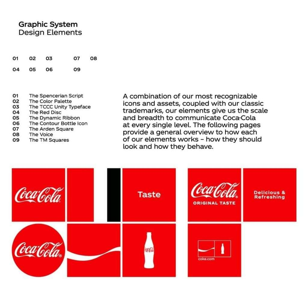
Compare that disaster to Coca-Cola's approach. Their brand guidelines don't just specify the Spencerian script and that specific red. They define their "Dynamic Ribbon" wave pattern, their "Contour Bottle Icon," their exact photographic style, and precisely how these elements work together across every possible application. They have rules for everything from billboard placement to social media posts to packaging design.
That's why Coca-Cola looks like Coca-Cola whether you see it on a billboard in Times Square or a local convenience store cooler.
The Five Elements That Actually Create Recognition
After almost a decade of rebuilding broken brand systems, I can tell you exactly which elements separate professional brands from amateur ones. The brands that work—the ones that look effortlessly consistent and instantly recognizable—focus on five specific elements that most brand guides completely ignore.
1. Imagery & Photographic Style: The Foundation of Emotional Connection
This is the most critical element, and it's the one everyone gets catastrophically wrong.
Your imagery doesn't just illustrate your content—it IS your brand's emotional foundation. It's not enough to say "use professional photos." You need to define the exact mood, lighting, subject matter, composition, and treatment that will make your content instantly recognizable.
Let me show you what systematic imagery looks like using one of my recent projects. Once Upon A Business operates what we call "Mystic Realism"—a deliberately crafted photographic style that we developed through a specific process:
Step 1: Emotional Target Definition
We identified that OUAB needed to convey both visionary thinking ("Once Upon a...") and grounded execution ("Business"). The imagery needed to feel magical but professional, aspirational but achievable.
Step 2: Technical Specifications
- Subject Matter: Natural elements (foliage, water, organic textures) combined with symbolic objects (books, keys, architectural elements)
- Lighting: High contrast with deep shadows and bright highlights to create drama
- Composition: Close-up details with shallow depth of field to create intimacy
- Color Treatment: Monochromatic purple wash applied via Color blend mode to unify disparate source images
- Mood: Gritty fairy tale—realistic textures with otherworldly atmosphere
Step 3: Application Rules
Every image gets processed through the same system:
- Source image selected based on emotional keyword (death = crows, growth = sprouting plants, etc.)
- Color overlay applied using specific hex codes with Color blend mode
- Additional contrast and texture adjustments to maintain consistency
- Text overlay system applied when needed for legibility
The result: Instant brand recognition. You can identify OUAB content in a social media feed from across the room, even without seeing the logo.
Compare that to Apple's systematically opposite approach: Clean, minimal, bright white backgrounds, perfect lighting that eliminates all shadows, precise product positioning. Both systems work because they're systematic and intentional.

Here's the process for developing your own photographic style:
Phase 1: Audit Your Current Reality
Collect every image you've used in marketing over the past six months. Print them out and lay them on a table. Do they look like they came from the same company? If not, you need a systematic approach.
Phase 2: Define Your Emotional Target
What specific feeling should people get when they see your imagery? Not generic words like "professional" or "trustworthy"—specific emotional states. Confident? Innovative? Reliable? Luxurious? Accessible? Pick ONE primary emotion and TWO secondary emotions.
Phase 3: Create Technical Specifications
- Lighting: Hard or soft? High contrast or even? Bright or moody?
- Composition: Close-ups or wide shots? Centered or rule-of-thirds?
- Subject Matter: People, objects, landscapes, abstracts? What's included/excluded?
- Color Treatment: Natural colors, filtered, monochromatic, high saturation?
- Mood Modifiers: Gritty or polished? Candid or staged? Motion or static?
Phase 4: Create Your Processing Template
Develop a specific technical process for making any image fit your style. This might include specific filters, color adjustments, cropping ratios, or overlay treatments.
Most businesses fail here because they never make these decisions consciously. They grab whatever stock photos look "professional" and wonder why their brand has no personality.
2. Shape, Form & Structural Language: The Invisible Architecture
Every professional brand has consistent rules about the shapes, forms, and structural elements they use. This is the invisible architecture that makes everything feel cohesive, even when the content is completely different.
The questions most brands never answer:
- Are your graphics built on hard-edged geometric shapes, or soft, organic curves?
- Do you use thin keylines or thick containers?
- Are your layouts based on rigid grids or flowing, asymmetrical compositions?
- Do you use borders, frames, or open layouts?
- What's your relationship with negative space—minimal or generous?
OUAB uses a comprehensive 8-point grid system that governs every layout decision:
Technical Specifications:
- All elements positioned on 8-pixel intervals
- Consistent margin systems (240px left/right, 160px top/bottom for landscape formats)
- Defined container weights (3-pixel strokes for frames)
- Specific gutter widths (40px between columns)
- Predetermined padding systems (160px internal padding)
Application Rules:
- Headers always positioned according to grid
- Text blocks never exceed defined column widths
- Images sized to grid proportions
- Consistent spacing between all elements
Why this matters: When someone from their team creates a new layout, they're not making creative decisions from scratch. They're applying established rules. The result looks professional and consistent, regardless of who created it.
Here's how to develop your structural language:
Step 1: Analyze What Works
Look at brands you admire in any industry. Screenshot their layouts and identify the underlying structure. Are they using centered layouts or asymmetrical ones? Lots of white space or densely packed? Geometric shapes or organic forms?
Step 2: Define Your Grid System
Choose a base unit (8px, 12px, 16px) and create rules for spacing, sizing, and positioning. This becomes your invisible framework for all design decisions.
Step 3: Establish Container Rules
How do you group information? Boxes, lines, white space, color blocks? What weights and styles for borders? When do you use them vs. open layouts?
Step 4: Create Layout Templates
Develop 3-5 standard layout templates for your most common needs (social posts, documents, presentations, etc.). These become your starting points, not creative challenges.
3. Color Hierarchy: The Strategic Psychology of When and Why
This is where I see the biggest failures in brand systems. Most brand guides list colors like paint samples: "Here's our red, here's our blue, good luck figuring out when to use them."
Professional brands define a color hierarchy that answers the crucial strategic question: When do we use each color, and why?
We solved this for ourselves with this content pillar system:
Strategic Color Assignments:
- Find The Work (#B6E8FC - Anakiwa Light): Aspirational, open-sky feeling representing opportunity seeking
- Get The Work (#7364D2 - Moody Blue): Action-oriented and magical, the active pursuit phase
- Do The Work (#3D0E61 - Jagger): Deep and foundational, representing execution and delivery
Technical Implementation:
Every image gets processed with the appropriate color overlay using Photoshop's "Color" blend mode. This creates instant categorization and recognition. You can identify which content pillar any OUAB post belongs to from across a room.
Supporting Color Rules:
- Primary Colors: Jagger (#3D0E61), Chetwode Blue Light (#A9ADEB), White (#FFFFFF), Black (#0A0A0A)
- Secondary Colors: Chetwode Blue (#858AE3), Anakiwa (#97DFFC), Jagger Light (#775690)
- Background Rules: Specific colors defined for different contexts
- Text Color Hierarchy: Black/White/Jagger for body text, Chetwode Blue for emphasis

Compare this systematic approach to McDonald's evolution. Over seven decades, they've maintained their red and yellow core while continuously refining the rules for using them. The colors haven't changed, but their strategic application has evolved with consumer preferences and media requirements.
Here's how to develop your color hierarchy:
Step 1: Audit Your Current Usage
Track how you're currently using colors. Are you randomly applying them, or is there a pattern? Most businesses discover they have no system whatsoever.
Step 2: Assign Strategic Meanings
Give each color a specific role:
- Primary Action Color: CTAs, links, urgent information
- Secondary Action Color: Supporting actions, navigation
- Background Colors: Page backgrounds, container fills
- Text Colors: Hierarchy from most to least important
- Accent Colors: Highlights, special callouts
Step 3: Create Usage Rules
Define exactly when and where each color appears:
- What percentage of a design can be your primary color?
- Which colors never appear together?
- How do you handle color in different contexts (web vs. print vs. social)?
- What's your hierarchy when you need to simplify to fewer colors?
Step 4: Develop Technical Specifications
Create exact instructions for color application:
- Specific hex codes for digital, CMYK for print, Pantone for special applications
- Overlay techniques for photography
- Accessibility compliance for text contrast
- Color behavior on different backgrounds
4. Typography Hierarchy: The Architecture of Information
Most brand guides fail catastrophically here. They'll specify "Use Helvetica" and call it done, leaving their team to figure out sizing, spacing, and hierarchy through trial and error.
Professional brands define comprehensive typographic systems that eliminate guesswork.
We (Once Upon A Business) used a precise two-typeface system with clearly defined roles:
Primary Typeface: Inter
- Role: All functional communication—headlines, body copy, professional materials
- Hierarchy Specifications:
- Title: 160pt
- H1: 128pt (3.5 REM)
- H2: 96pt (3 REM)
- H3: 64pt (2.5 REM)
- H4: 48pt (2 REM)
- Large Paragraph: 40pt (1.5 REM)
- Medium Paragraph: 32pt (1 REM)
- Small Paragraph: 24pt (0.5 REM)
Weight Rules:
- Bold: Only for paragraph text (never headers—too overpowering)
- Semi-Bold: Last word of titles/H1, or entire H3/H4
- Medium: Default for titles and headers
- Regular: Default for paragraph text
Secondary Typeface: Beauty Salon Script
- Role: Narrative accent representing the "Once Upon a..." brand element
- Strategic Restrictions:
- Never for body copy (readability issues)
- Maximum one element per screen/page (maintains impact)
- Only for specific applications: pre-headline kickers, brand pillars, emphatic taglines
- Always in Jagger color (#3D0E61)
Technical Specifications:
- Stroke Requirements: 1pt stroke per 100pt size to maintain weight consistency
- Size Limitations: Must be large enough for legibility (minimum 40pt)
- Spacing Rules: Specific line height and letter spacing for different applications
Link Standards:
- Text Treatment: Bold, underlined with wavy underline (10pt thickness, 10pt offset)
- Color: Jagger Light (#775690)
- Behavior: Skip ink around descenders for clean appearance
This level of specification eliminates design decisions. Anyone on their team can create typography that looks professional and on-brand because the rules handle the decisions.
Here's how to develop your typography hierarchy:
Step 1: Inventory Your Content Types
List every type of text you use: headlines, subheads, body copy, captions, CTAs, navigation, legal text, etc. Most businesses have 8-12 distinct text types.
Step 2: Establish Relationships
Define the size and weight relationships between different text types. Your system should create clear visual hierarchy without requiring color or other elements.
Step 3: Create Usage Rules
Define exactly when to use each text treatment:
- What's a headline vs. a subhead vs. a large paragraph?
- How do you handle emphasis within body copy?
- What about quotes, lists, captions?
- How does typography change across different media?
Step 4: Technical Specifications
Document exact sizing, spacing, and formatting:
- Font sizes and weights for each application
- Line height and letter spacing specifications
- Color applications for different contexts
- Responsive behavior for different screen sizes
5. Legibility & Technical Systems: The Details That Enable Professionalism
Here's what separates amateur brands from professional ones: systematic solutions to technical problems.
Most businesses handle these issues ad hoc. Professional brands develop systematic approaches that work every time.
Text Over Imagery: The Universal Challenge
Every brand faces this: How do you ensure text is readable over your imagery? Amateur brands solve this differently every time—sometimes a drop shadow, sometimes a white box, sometimes they just hope for the best.
We (Once Upon A Business) developed a systematic solution for ourselves:
Technical Specifications:
- Gradient Overlay: Linear gradient at 117.7-degree angle
- Color Stops:
- 0%: #858AE3 at 95% opacity
- 50%: #858AE3 at 50% opacity
- 100%: #000000 at 0% opacity
Application Rules:
- Applied to all text-over-image situations
- Consistent angle and color stops regardless of image content
- Works with their color-treated imagery system
- Maintains brand consistency while ensuring legibility
The result: Every image can support readable text using this exact formula. No creative decisions required, professional results guaranteed.
Other Technical Systems Professional Brands Develop:
Logo Application Rules:
- Minimum sizes for different applications
- Clear space requirements
- Acceptable color variations
- What to do on complex backgrounds
- File format specifications for different uses
Print vs. Digital Specifications:
- Color profiles for different output methods
- Resolution requirements
- Font substitution rules when brand fonts aren't available
- How layouts adapt across different formats
Accessibility Compliance:
- Color contrast ratios for text readability
- Alternative text specifications for images
- Font size minimums for different audiences
- Color-blind accessible color combinations
Here's how to develop your technical systems:
Step 1: Inventory Your Applications
List every way your brand appears: website, social media, print materials, signage, presentations, etc. Each has different technical requirements.
Step 2: Identify Recurring Challenges
What problems do you solve differently each time? Text legibility, logo placement, color reproduction, image sizing, etc.
Step 3: Develop Systematic Solutions
Create specific technical approaches for each challenge. Document the exact steps, measurements, and specifications.
Step 4: Test and Refine
Apply your systems across different scenarios and refine based on real-world performance.
The Implementation Roadmap: How to Build Your System
Most businesses fail at implementation because they try to do everything at once. Building a comprehensive brand system is a 3-6 month process that should be approached systematically.
Phase 1: Foundation Assessment (Week 1-2)
Step 1: Complete Brand Audit
- Collect every marketing material from the past 12 months
- Print physical copies and lay them out
- Identify inconsistencies and patterns
- Document what's working vs. what's not
Step 2: Define Brand Strategy
- Clarify your primary emotional target
- Identify your differentiation from competitors
- Define your audience's preferences and expectations
- Establish your brand personality (professional spectrum)
Step 3: Competitive Analysis
- Analyze 5-10 competitors' visual approaches
- Identify opportunities for differentiation
- Document what's standard vs. distinctive in your industry
- Find inspiration from non-competing industries
Phase 2: Visual Foundation (Week 3-6)
Step 1: Develop Imagery Style
- Define your photographic approach using the framework above
- Create 10-15 test images following your specifications
- Develop technical processing templates
- Test recognition and emotional response
Step 2: Establish Color Hierarchy
- Audit current color usage patterns
- Assign strategic meanings to each color
- Create technical application specifications
- Test across different applications and contexts
Step 3: Define Structural Language
- Establish grid systems and spacing rules
- Create layout templates for common applications
- Define container and border specifications
- Test consistency across different content types
Phase 3: Typography & Technical Systems (Week 7-10)
Step 1: Typography Hierarchy
- Select and specify primary and secondary typefaces
- Define complete size and weight hierarchy
- Create usage rules for different contexts
- Test readability and brand alignment
Step 2: Technical Specifications
- Develop solutions for text-over-image situations
- Create logo application guidelines
- Establish print vs. digital specifications
- Ensure accessibility compliance
Step 3: Documentation Creation
- Create comprehensive brand guidelines document
- Include visual examples of correct/incorrect usage
- Provide technical specifications for implementation
- Create quick-reference guides for common applications
Phase 4: Testing & Refinement (Week 11-12)
Step 1: System Testing
- Create 10-15 different marketing materials using only the system
- Test with team members who weren't involved in development
- Identify gaps or unclear specifications
- Refine based on real-world usage
Step 2: Team Training
- Train internal team on system usage
- Create templates and shortcuts for common applications
- Establish approval processes and quality controls
- Document common mistakes and solutions
Step 3: Launch Preparation
- Audit all existing materials for compliance
- Create transition plan for outdated materials
- Establish ongoing maintenance procedures
- Plan for system updates and evolution
Advanced Applications: Beyond the Basics
Once you have a solid foundation, professional brand systems handle sophisticated challenges that separate industry leaders from followers.
Multi-Brand Architecture
Challenge: What happens when your business has multiple service lines, locations, or audiences that need different approaches while maintaining connection to the parent brand?
Solution: Develop a master brand system with defined variation rules.
Example Approach:
- Master Brand: Core colors, primary typography, foundational imagery style
- Sub-Brand Variations:
- Modified color palettes that maintain family relationships
- Imagery style variations that share technical specifications
- Typography modifications that preserve hierarchy relationships
- Logo variations that maintain core recognition elements
Seasonal and Campaign Adaptations
Challenge: How do you maintain brand consistency while allowing for timely, relevant variations?
Solution: Create flexible systems that accommodate variation within defined parameters.
Framework:
- Unchangeable Elements: Core logo, primary colors, foundational typography
- Flexible Elements: Secondary colors, imagery filters, accent elements
- Seasonal Rules: How far variations can deviate while maintaining recognition
- Return Protocol: How and when to return to core brand expression
International and Cultural Variations
Challenge: Adapting your brand system for different cultural contexts while maintaining global recognition.
Solution: Develop cultural sensitivity guidelines within your core system.
Considerations:
- Color Psychology: How your colors are perceived in different cultures
- Typography: Local language requirements and reading patterns
- Imagery: Cultural appropriateness and relevance
- Layout: Adaptation for right-to-left languages or different formatting conventions
Digital vs. Physical Integration
Challenge: Ensuring your brand system works seamlessly across digital and physical applications.
Solution: Develop platform-specific specifications that maintain brand integrity.
Technical Requirements:
- Color Profiles: RGB vs. CMYK vs. Pantone specifications
- Resolution Standards: Different requirements for screen vs. print
- Typography: Web font vs. print font specifications and fallbacks
- Sizing: How elements scale across different applications
- Interactive Elements: How brand system handles hover states, animations, etc.
Handling the Predictable Objections
After almost a decade in this business, we can predict exactly what objections you're thinking right now. Let me address them directly:
"This Seems Too Rigid/Corporate for Our Creative Business"
- The Reality: Constraints enable creativity, they don't limit it. The most creative agencies, design firms, and artists have the most systematic approaches to their own branding.
- Proof Point: Look at Apple, Nike, or any other "creative" brand you admire. Their brand systems are incredibly rigid and systematic. That's what enables them to consistently produce work that feels fresh while remaining instantly recognizable.
- The Psychology: When you eliminate basic decisions (colors, fonts, layouts), your brain has more capacity for creative content and strategy. The system handles the "how," so you can focus on the "what" and "why."
"Our Audience Likes Variety, Won't This Be Boring?"
- The Misunderstanding: Variety in content is not the same as variety in brand expression. You can cover infinite topics while maintaining consistent visual identity.
- Example: The New York Times covers everything from politics to recipes to sports, but every article looks unmistakably like The New York Times. The variety is in content, not brand expression.
- The Strategy: Professional brands create variety through content, messaging, and topics while maintaining visual consistency. This builds recognition and trust while still providing engaging diversity.
"We Can't Afford This Level of Detail"
- The Math: The upfront investment in a proper brand system pays for itself within 3-6 months through efficiency gains alone.Cost Comparison:
- Current Approach: 4-6 hours per marketing piece × $50/hour × 20 pieces/month = $4,000-6,000/month in time costs
- System Approach: 1-2 hours per marketing piece × $50/hour × 20 pieces/month = $1,000-2,000/month in time costs
- Savings: $3,000-4,000/month = $36,000-48,000/year
- Hidden Costs You're Already Paying:
- Revision cycles because things don't look "right"
- Training time for new team members
- Inconsistent results that hurt conversion rates
- Inability to delegate marketing tasks effectively
"Our Industry Is Different"
- The Reality: Every industry thinks they're different. The principles of visual consistency, systematic decision-making, and efficient brand application work regardless of industry.
- Examples:
- Law Firms: Need to convey trust and authority—systematic branding enhances credibility
- Creative Agencies: Need to demonstrate design competence—having a tight system shows expertise
- Healthcare: Need to communicate professionalism and care—consistency builds patient confidence
- Manufacturing: Need to convey reliability and competence—systematic branding supports this positioning
- The Truth: The more "different" your industry thinks it is, the more opportunity exists for systematic branding to create competitive advantage.
Measuring Success: How to Know Your System Is Working
Most businesses build brand systems and then never measure whether they're actually working. Here's how to track the effectiveness of your investment
Efficiency Metrics
Time-to-Creation Tracking
- Before System: Average time to create marketing materials
- After System: New average time with established templates and rules
- Target: 60-80% reduction in creation time within 3 months
Revision Cycle Reduction
- Before System: Average rounds of revisions per marketing piece
- After System: Revisions needed when following system guidelines
- Target: 70%+ reduction in revision cycles
Delegation Success Rate
- Before System: Percentage of delegated marketing tasks that met standards without revision
- After System: Success rate when team follows established system
- Target: 85%+ success rate for system-compliant work
Recognition and Consistency Metrics
Brand Recognition Testing
- Method: Show system-compliant materials without logos to target audience
- Measurement: Percentage who correctly identify your brand
- Target: 60%+ recognition within 6 months of system implementation
Consistency Audit Scoring
- Method: Quarterly audit of all marketing materials using standardized checklist
- Measurement: Percentage compliance with brand system specifications
- Target: 90%+ compliance across all applications
Cross-Channel Coherence
- Method: Survey audience about brand consistency across different touchpoints
- Measurement: Perception of brand consistency across website, social, print, etc.
- Target: 80%+ rating brand as "very consistent" across channels
Business Impact Metrics
Marketing Efficiency ROI
- Calculation: (Time saved × hourly rate) - System development cost
- Target: Positive ROI within 6 months, 300%+ ROI within 12 months
Team Confidence and Autonomy
- Method: Regular surveys of team members creating marketing materials
- Measurement: Confidence level in creating on-brand materials independently
- Target: 90%+ confidence rating within 3 months of training
Conversion Rate Impact
- Method: A/B testing of system-compliant vs. legacy marketing materials
- Measurement: Difference in conversion rates, engagement, etc.
- Target: 15-25% improvement in performance metrics
Long-Term Strategic Metrics
Scalability Indicators
- Measurement: Ability to maintain brand consistency while increasing marketing volume
- Target: Linear relationship between output volume and consistency maintenance
Competitive Differentiation
- Method: Quarterly competitive analysis of visual positioning
- Measurement: Distinctive visual position vs. competitors
- Target: Clear differentiation maintained across all brand touchpoints
Brand Equity Growth
- Method: Annual brand perception studies measuring professional appearance, trustworthiness, etc.
- Measurement: Year-over-year improvement in brand perception metrics
- Target: Consistent improvement in professional perception scores
The Reality Check: What Happens If You Don't Fix This
Let me be brutally honest about what you're facing if you continue with your current approach:
Immediate Consequences (Next 6 Months):
- Continued time hemorrhaging on marketing creation
- Inconsistent brand presentation hurting credibility
- Inability to effectively delegate marketing tasks
- Missed opportunities due to slow marketing response times
Medium-Term Impact (6-18 Months):
- Falling behind competitors with systematic approaches
- Increased difficulty hiring marketing help
- Brand confusion in the marketplace
- Scaling challenges as inconsistency compounds
Long-Term Damage (18+ Months):
- Established perception as an amateur or inconsistent brand
- Significant competitive disadvantage in professional positioning
- Internal inefficiencies becoming embedded in company culture
- Much higher cost and difficulty to rebrand later
The Compounding Effect: Every day you wait, this problem gets more expensive to fix. You're not just maintaining the status quo—you're falling further behind competitors who are building systematic advantages.
Stop Buying Logos. Start Building Systems
The brands that dominate their industries—Apple, Nike, Coca-Cola, McDonald's—don't succeed because they have great logos. They succeed because they have comprehensive visual systems that work flawlessly across every possible application.
Your brand is not a piece of art to be admired. It's a set of tools that need to be used.
If your current brand guidelines are just a logo, some colors, and a font name, you're not ready to scale. You're not ready to hire marketing help. You're not ready to maintain consistency as you grow.
The businesses winning in today's market aren't the ones with the prettiest logos—they're the ones with the most functional systems.
Here's what you need to do right now:
- Audit your current reality using the framework in this post
- Calculate what inconsistency is costing you in time and opportunity
- Choose your implementation approach—internal development or professional help
- Commit to the full process, not just the easy parts
- Measure your results and refine based on real-world performance
And if anyone tells you that comprehensive brand systems are "too restrictive" or "will limit creativity," find someone else to work with.
The constraint of a well-designed system is what enables the freedom of efficient, professional marketing. Without it, you're not creative—you're just inconsistent.
Ready to build a brand system that actually works? The time you spend building it properly will pay dividends in efficiency, consistency, and competitive advantage for years to come. The question isn't whether you can afford to do this—it's whether you can afford not to.

Discover Your Happily Ever After
Subscribe to get weekly updates on how you can start handling departmental plot holes in your story!
Related posts
Check out other posts similar to the one you just read!